KaBuM! iOS App Redesign
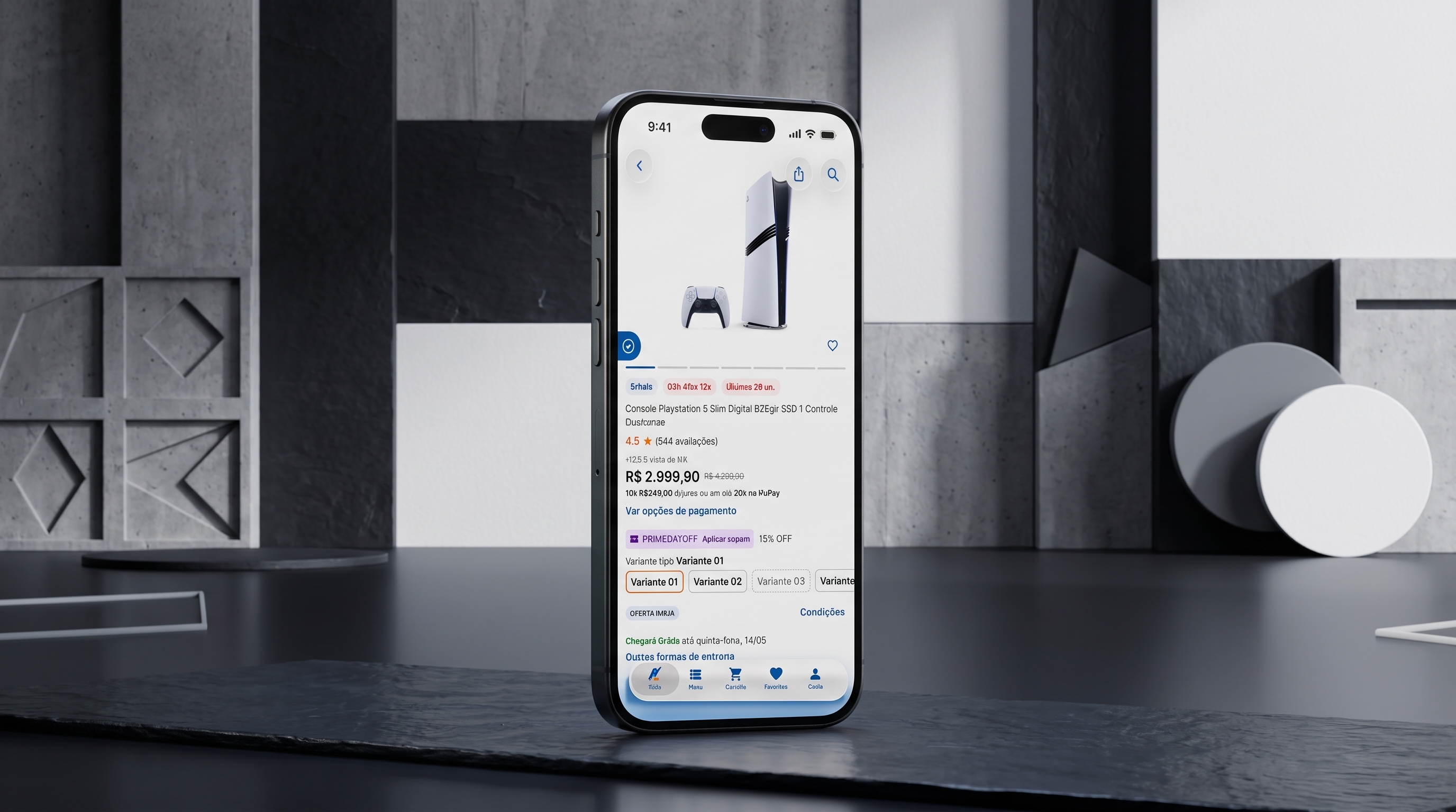
KaBuM! iOS App Redesign
01 / context
context and problem
The web brings the traffic, but the iOS app brings the buyers. In KaBuM!'s Google Analytics funnel, iOS is about 2% of product-page users, yet 49% of them add to cart, against around 11% on web mobile and desktop. People who install the app usually come to buy.
The app did not deserve them. It mirrored the website almost one to one, with the same navigation, the same components and no native behavior. Faced with a weak app or the website, many customers chose the website to browse.
The problem was not one broken screen. Structure, hierarchy and product discovery all needed rethinking, and even the people who stayed leaked out of the funnel: 50.97% left at the product page and 56.1% left after adding to cart.
Goal
Make the app the best place to discover and buy hardware, peripherals and games, not a smaller version of the site.
Constraints
One UX designer, two iOS engineers, and a design system, DS.Sensei, that every screen had to respect.


02 / discovery
discovery
Three data sources and a set of benchmarks pointed to the same conclusion: the app needed to be designed as an app.
Google Analytics: the app converts, and still leaks
On iOS, 22.86% of product-page users end up buying, against 17.89% on Android. Even so, 56.1% of iOS carts are abandoned.
Clarity: mobile is the default context
Mobile accounts for 60.84% of recorded sessions (438,211), against 38.30% on PC. Designing for one hand and a thumb is the main case, not an edge case.
App Store reviews: people who want to buy and cannot
I coded the iOS reviews since June 2025 in a spreadsheet. Of 104 ratings, 58 are one star and 29 are five stars. Of 72 coded mentions, 37 (51%) concern the experience of use itself: login, interface and bugs.
The recurring signals
Login and sign-up loops that stop people from buying at all. A cart and a session lost every time the app closes. Product photos too small to inspect, a real problem for motherboards and their ports. Address fields locked after entering the ZIP code. A build-your-PC tool that cannot skip a step or be edited afterward. Intrusive notifications, and a first-purchase coupon that is not applied automatically. One customer said the app feels ten years old.
Benchmarks
I studied Apple's own apps for native behavior, and Amazon, Crumbl and other US apps for how mature app-first products guide discovery and purchase. I borrowed behaviors, not looks, and adapted them to shoppers who compare hardware, peripherals and games.
| Platform | Product-page users | Add to cart |
|---|---|---|
| iOS | 499,886 | 49.03% |
| Android | 1,241,390 | 44.77% |
| Web mobile | 13,694,424 | 10.85% |
| Desktop | 8,457,673 | 11.45% |
Login problems are the top complaint in iOS reviews
72 coded mentions by theme, App Store reviews since June 2025
- Login problems18
- UX and UI12
- Discounts and coupons8
- Delivery times8
- Bugs and slowness7
- Customer support5
- Post-purchase issues4
- All other topics10
Login, UX and UI, and bugs together: 37 of 72 mentions (51%)
| Theme | Mentions |
|---|---|
| Login problems | 18 |
| UX and UI | 12 |
| Discounts and coupons | 8 |
| Delivery times | 8 |
| Bugs and slowness | 7 |
| Customer support | 5 |
| Post-purchase issues | 4 |
| All other topics | 10 |
03 / insight
insight and design principles
The app did not lack features; it lacked a point of view about being an app. Every screen asked customers to notice, decide and act manually, as they would on a desktop browser. Four principles turned that diagnosis into design rules.
Native first
System navigation, menus, sheets and haptics before anything custom.
Thumb first, right hand first
The actions that matter most live where the right thumb rests.
Hierarchy over decoration
One accent color, and color that means something. Liquid Glass is reserved for the navigation layers.
Built on the system
Every screen is assembled from DS.Sensei components and tokens.
04 / decisions
key decisions
Five decisions carried most of the redesign.
Native navigation, with the cart at the center
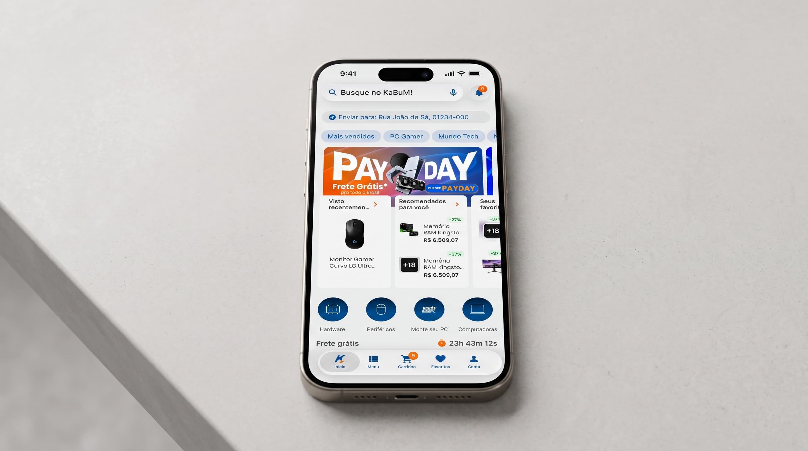
The app now uses the system back button and a five-tab bar: Home, Menu, Cart, Favorites and Account. The cart sits at the center with a live item count, inside natural thumb reach instead of the top bar. Both bars come straight from DS.Sensei, so the navigation is a system component, not a one-off.
A product card that answers the buying question
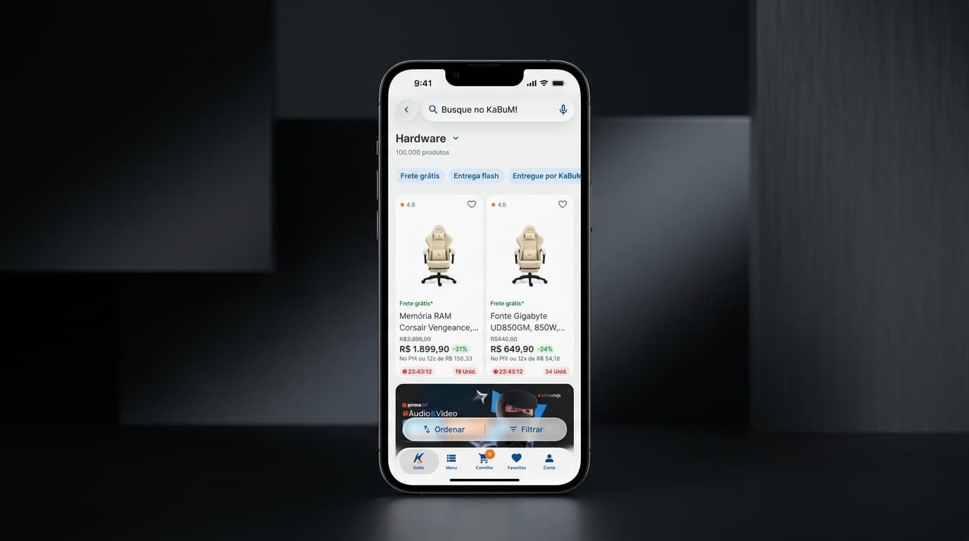
For someone comparing a power supply or a memory kit, the decision comes down to price, shipping and trust. The card orders information by that decision: rating, favorite and quick add-to-cart on top, then perks such as a free gift, shipping and coupon tags, the discounted price, the PIX price and installments, and finally the time and stock left. Color carries the hierarchy: green means savings and free shipping, purple marks a coupon, red signals urgency, and KaBuM! blue marks what can be tapped.
Built for the right thumb
Sort and Filter live in a floating bar at the bottom of the listing, where the thumb already rests. In the Filters sheet, the one action, Filter, sits at the bottom with a live count of applied filters, and Clear sits at the top right. Across the app, the most-tapped actions sit on the right side of the screen, matching a right-thumb grip.
Native capabilities a website cannot offer
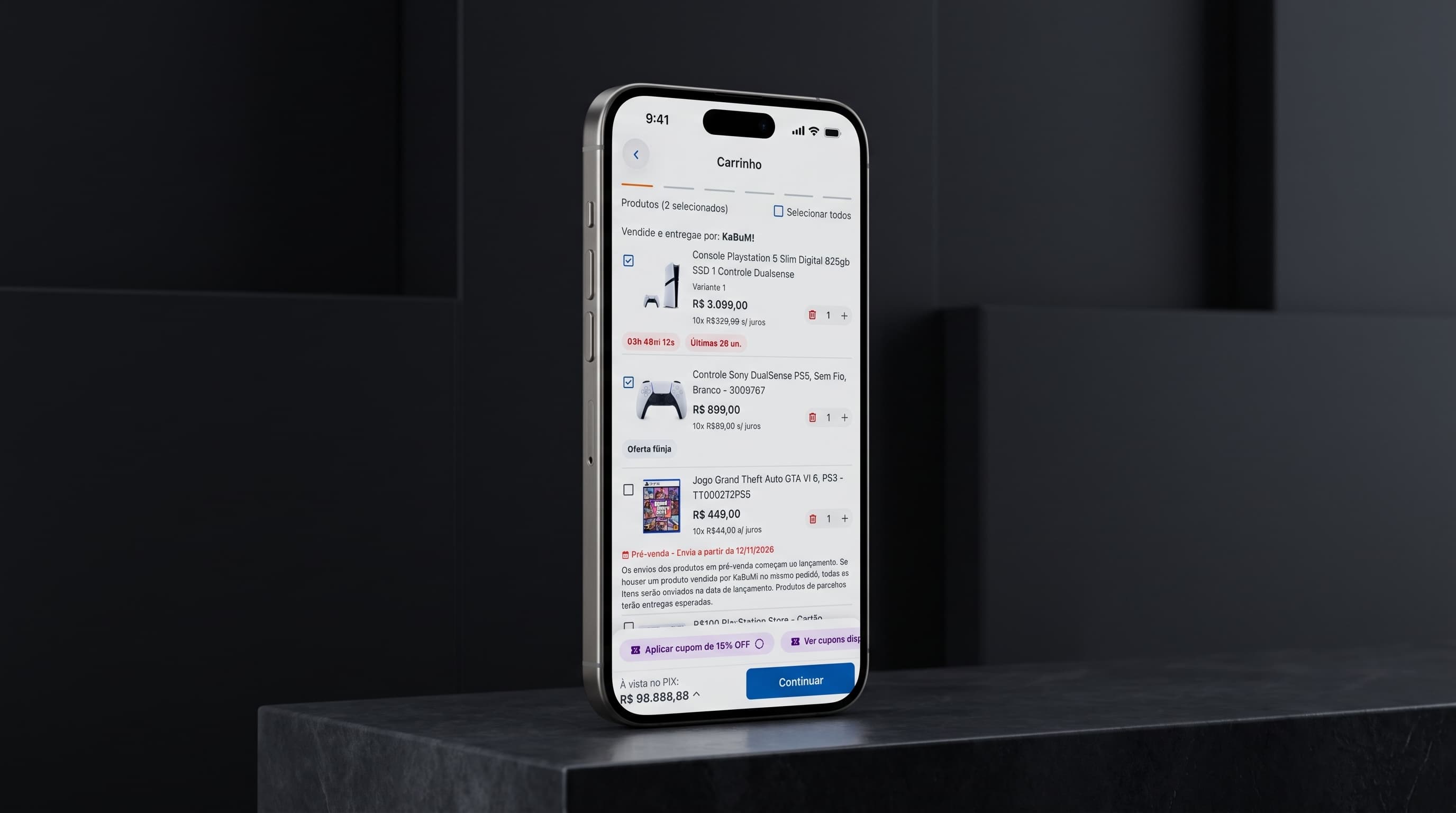
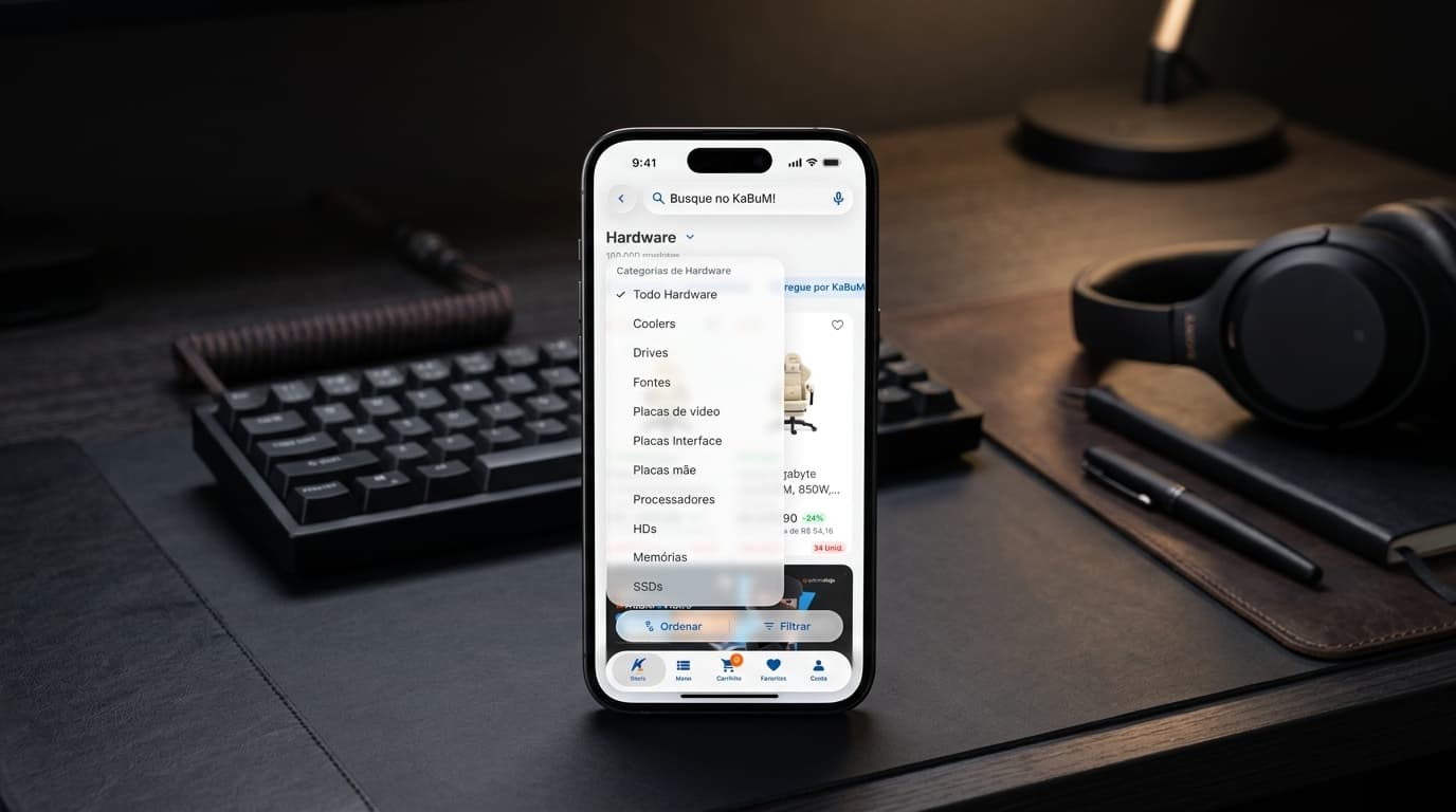
A system menu to switch categories inside Hardware, from coolers to SSDs. Native toggles for quick filters such as free shipping, flash delivery and OpenBox. Liquid Glass bars and the system back button, with scroll-edge behavior handled by iOS. Selection and success haptics on key actions. An add-to-cart animation that flies the product into the cart tab, confirming the action without a toast. A screenshot taken on a product page opens the native share sheet.
A full page for protection plans
Extended warranty and theft or accidental-damage insurance became a pushed page, not a bottom sheet, because it is a money decision that needs room. All warranty durations are visible at once with checkmark selection, and 12 months comes pre-selected with a Recommended badge. Insurance is a native toggle, and details sit in disclosure groups. A floating Liquid Glass bar keeps one prominent action, Add protection, with a running total, for example R$ 459.80 for 24 months of warranty plus insurance. The button stays disabled until something is selected. I specified eight states for the page, including dark mode and accessibility-size Dynamic Type.
05 / process
process: designing with claude design and the figma mcp
I used Claude Design as a fast builder of the base and kept the diagnosis, the constraints and every decision for myself. The work ran in six steps, always on top of DS.Sensei.
Each prompt followed the same pattern, shown by the Services page prompt. It fixes the scope: one screen only, and what it is not, a pushed page and not a bottom sheet. It carries the real copy, prices and conditions verbatim. It names the iOS components explicitly, such as inset grouped lists, a native toggle, disclosure groups and the system back button. It sets the visual rules: one accent color, and Liquid Glass only on the navigation and bottom bars. And it lists eight states to deliver, plus a switcher to move between them and between light and dark.
The Figma MCP kept the generated base honest. Instead of redrawing buttons, bars and tokens, I could bring the output into Figma and tie it to the real DS.Sensei components and variables, so engineers receive the system and not a lookalike.
The scope was every screen, bottom sheet and navigation flow of the new experience. By my estimate, drawing it by hand in Figma takes about three months; with Claude Design it took about 20 days.
AI compressed the drawing, not the thinking. The research, the choices about what to build and what to leave out, the guardrails in each prompt and the review against the design system were all mine. The guardrails show where the tool needs them: the Services prompt insists on a page and not a sheet, on system components over custom ones, and on a single accent color.
Research
Google Analytics funnels, Clarity, App Store reviews and benchmarks became a problem statement and a list of requirements.
Prompt
I wrote one structured prompt per screen using the CREATE method.
Base in Claude Design
Interactive iPhone prototypes, with their states and light and dark modes.
Refinement in Figma
Through the Figma MCP, I adjusted the output against the DS.Sensei components and variables.
Review with Claude
The refined result went back to Claude for another pass.
Engineering alignment
I aligned with the iOS engineers on a result built from system components.
06 / delivery
delivery under constraints
KaBuM! has two iOS engineers, so capacity shaped the plan as much as users did. I split the work into increments that can each ship on their own, and favored native components, which cost less to build than custom ones.
My design scope is complete. Part of the new experience is already in users' hands; the engineers are shipping the rest step by step, and some of the features described in this case are still in development.
07 / impact
impact and baselines
The rollout is still in progress, so I am not claiming a conversion lift yet. I am measuring each shipped phase against these baselines, plus the 49.03% product-page-to-cart rate on iOS shown in the discovery section. On delivery speed, the full UI scope took about 20 days with Claude Design, against an estimated three months by hand in Figma.
43.9%
add to cart to purchase
iOS baseline from the Google Analytics funnel.
22.86%
product page to purchase
iOS baseline from the Google Analytics funnel.
56%
one-star iOS ratings
58 of 104 App Store ratings since June 2025.
25%
login problems in reviews
18 of 72 coded review mentions.
08 / reflections
reflections
The prompt is the brief
When AI does the drawing, the scarce skill moves from pushing pixels to specifying and judging. The more precise my constraints, the less I had to fix.
A design system makes AI output shippable
Fast screens nobody can build are worthless. Tied to DS.Sensei, the output lands as components the engineers already know.
Capacity is a design constraint
Planning for two engineers taught me to design in increments that each stand on their own.
Next
Measure each shipped phase against the baselines above before the next set of features goes out.
the team
Vitória Gomes
Product Designer, sole UX designer. Research, UX, UI, prototyping and handoff.

Rogério Castelo Branco
iOS Software Engineer

Jheniffer Dias da Silva
iOS Software Engineer
Next project
wellness clinic dashboard →
An operational hub connecting scheduling, patients, and payments.
Let's talk?
If you're building something complex and need someone who thinks in systems before thinking in screens, let's talk!
Built with Claude Design & Code by Vitória Gomes.