ds.sensei; design system
ds.sensei; design system
01 / context and the problem
context and the problem
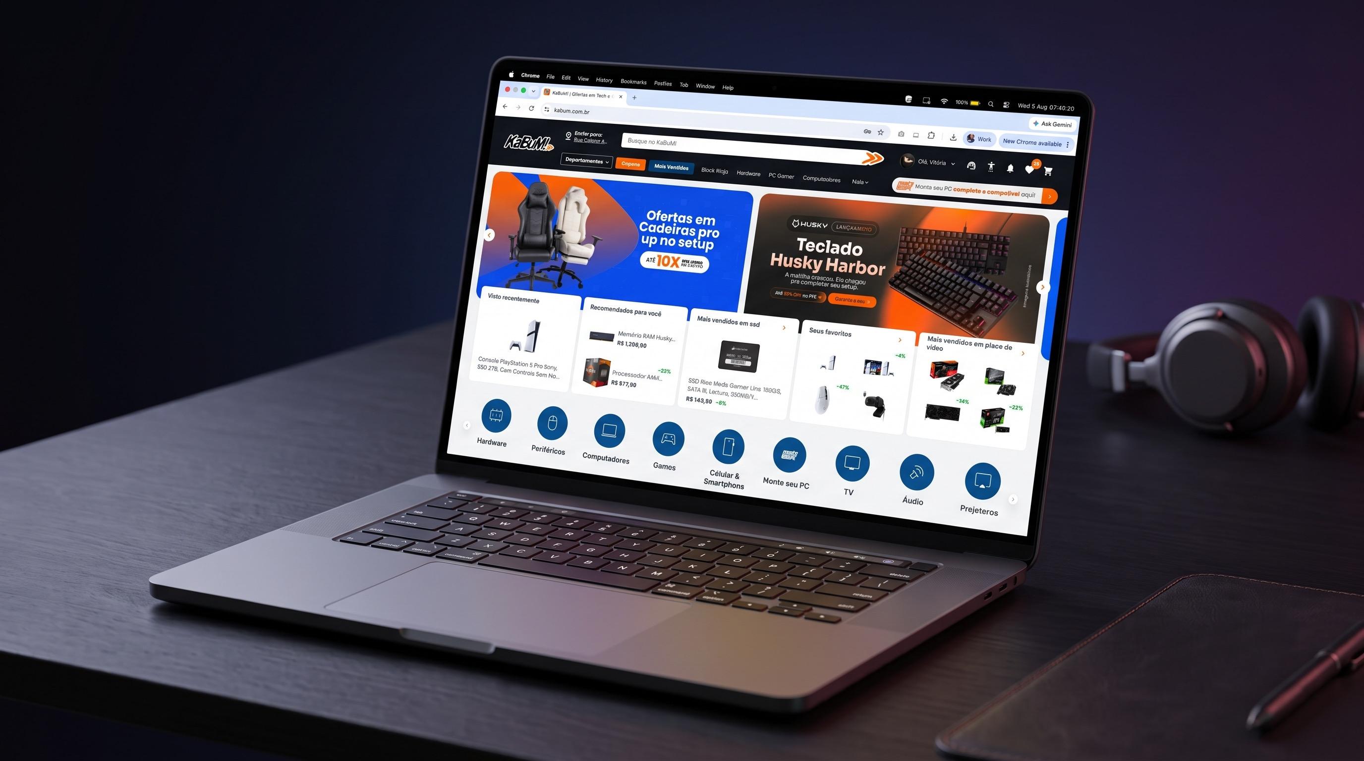
Before DS.Sensei, every squad at KaBuM! solved UI on its own. There was no UI kit, the style guide was practically empty, and no component followed a shared standard. Each squad had its own button, its own color scale, font, and sizing. The product card, the most-used component on the entire platform, had so many loose variations that it became the symbol of the problem: nobody could tell anymore which version was the right one.
The cost showed up every day. Handoff between design and engineering took more than two sprints because every delivery required negotiating visual details that should have already been settled. Components broke between teams because there was no single source of truth.
02 / purpose and identity
purpose and identity
DS.Sensei is KaBuM!'s official Design System, used across two distinct environments: the Platform, built for the end customer, and the BackOffice, which powers internal tools like MegaDash and the Seller Portal.
The name carries the system's logic. Just as a sensei trains with discipline and purpose, DS.Sensei guides product, design, and engineering squads with clear guidelines, reusable components, and scalable tokens, keeping identity cohesive no matter the tower or domain.
03 / architecture and governance
Figma, Storybook, Jira, Confluence
architecture and governance
The system rests on six pillars:
Tokens
The foundational values (color, typography, spacing, shadow, border, breakpoint) work as controlled variables. Every interface is built from them, which makes maintenance viable at scale.
Core Components
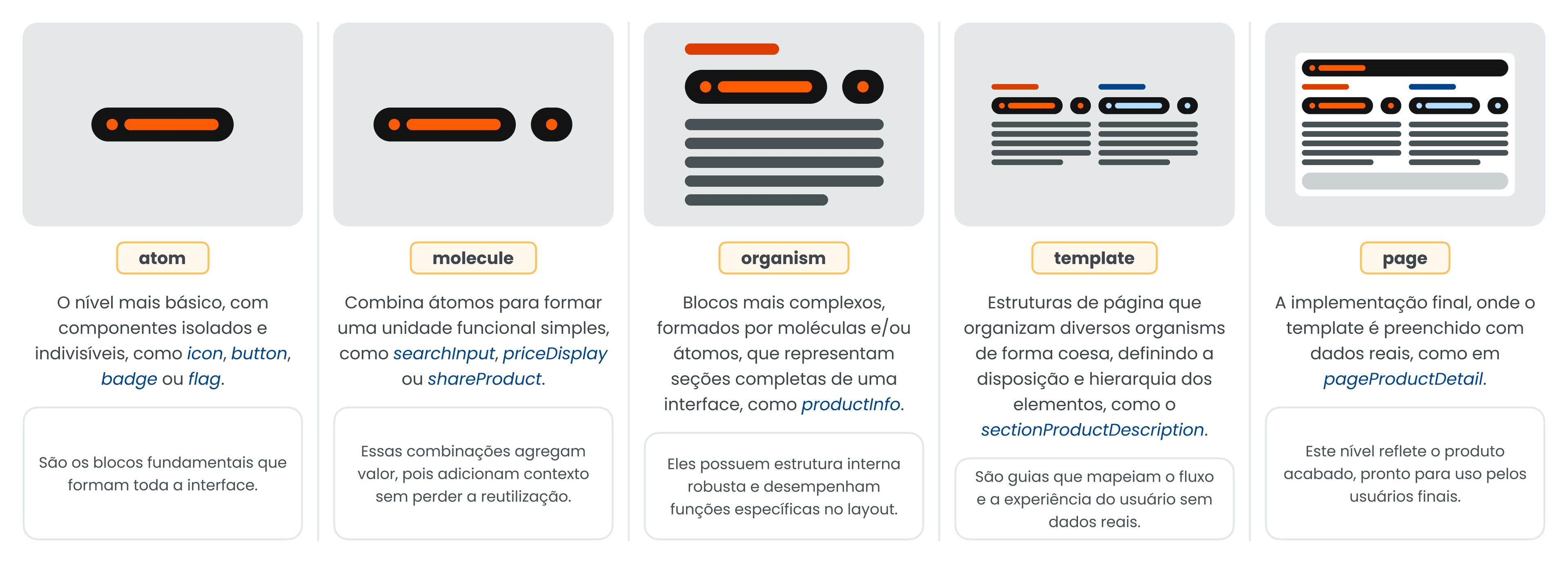
Essential, context-agnostic blocks: buttons, icons, form fields, modals, tooltips, alerts. They serve as the foundation for everything built on top, with their own structures organized by environment, Platform and BackOffice, keeping consistency without flattening the visual differences between the two.
Components by tower
Each domain (Products, MSPC, Customers, Payments, Backoffice) has its own components, built on top of Core and Tokens, carrying that area's specific business rules. This gives each squad autonomy without breaking standardization.
Documentation
Every component is documented through a standardized spec sheet with thirteen fixed sections: definition, usage context, variations, responsiveness, constraints, states, dependencies, acceptance criteria, accessibility, best practices, anatomy, and versioning. The accessibility section covers aria-labels, keyboard focus, WCAG/APCA contrast, and screen reader behavior, removing the dependency on any one designer's individual knowledge.
Governance and evolution
The system runs on a continuous cycle of contribution, review, and versioning. Since 2023, the model has evolved from a one-off effort into a responsibility shared across squads, sustained by critique and review every sprint.
Cross-team integration
Versioning follows the vA.B.C_CODE pattern, where the code maps directly to the Jira task that triggered the change. That means every component change is traceable back to the backlog, tying design decisions to engineering delivery with no ambiguity about who asked for what, and when.
04 / collaboration between design and engineering
Figma, Jira, Storybook
collaboration between design and engineering
The data on adoption and versioning proves that this collaboration moved off the page and into practice.
Real adoption
For tokens, 73% of all insertions come from the K5 Platform, meaning product and engineering teams using the token outside the DS team's own Figma file. For core components, that share climbs to 92%. That means the system is being consumed in production by the squads building KaBuM!, not just maintained internally by the design team.
Versioning integrated with Jira
Every component carries a changelog and task code, so a visual change is never left floating — it's always tied to a recorded, traceable decision between design and engineering.
05 / the ds as a product
the ds as a product
DS.Sensei serves three audiences at once, each with different demands: KaBuM!'s end customer, who needs consistency and trust in the interface; the Product Designer, who needs clear documentation to decide fast without reinventing solutions; and engineering, which needs predictable, versioned, and traceable tokens and components.
That's explicit in how the system positions itself: not as a visual repository, but as a bridge between disciplines, reducing rework and aligning expectations across squads.
1/2
half a sprint until the handoff (developer <> designer)
Handoff that used to take more than two sprints now runs on components and tokens that are already validated and documented.
92%
production adoption
73% of token insertions and 92% of core component insertions coming from product squads, not the DS team.
the team
Vitória Gomes
Direct owner · leading 2024 and 2025

Victor Franco
Direct owner · Main Designer

William Freire
Direct owner · Tech Lead

Daniel Scabora
UX Research · Cross-squad

Camila Costa
Customer squad

Fernanda Baldim
Products squad

Mauricio Figueiredo
Product Design Head

Next project
redesign app ios →
Native, thumb-first interaction patterns applied to the KaBuM! iOS app.
Let's talk?
If you're building something complex and need someone who thinks in systems before thinking in screens, let's talk!
Built with Claude Design & Code by Vitória Gomes.